
How All the Lightroom Settings Work: A Complete Guide for Photographers
- Cienna So
- Jan 24
- 8 min read
Updated: Feb 18
Imagine finally understanding every slider in Lightroom, so that every edit feels like a confident, creative decision. This guide is your step-by-step roadmap to mastering Lightroom’s settings—no more guessing, just clear, actionable insights.
Inside, you'll find straightforward, text-based explanations for each Lightroom setting, breaking down the tools that control brightness, tone, and color. Whether you're new to Lightroom or looking to refine your editing skills, you'll discover how even small tweaks can lead to impressive improvements in your photos.
Ready to transform your editing process? Let's dive in.
Part I: Understanding the Basic Panel in Lightroom
The Basic Panel is where you’ll spend a lot of your time, so it’s important to know what each slider does.
Here’s a breakdown:

Temperature & Tint
Temperature: Adjusts the warmth or coolness of your image. Slide to the right for a warmer feel or to the left for a cooler tone.
Tint: Balances the green and magenta hues. Use this to correct any color shifts and keep your image looking natural.
Exposure & Contrast
Exposure: Sets the overall brightness. Increase it to brighten your photo or decrease it for a moodier feel.
Contrast: Boosts the difference between light and dark areas. A little contrast can add depth, while less can soften the overall look.
Tip: If your photo seems flat, try a small increase in contrast to bring out more detail.
Highlights, Shadows, Whites & Blacks
Highlights: Lowering this slider can recover detail in bright, overexposed areas.
Shadows: Lifting shadows helps reveal details in the darker parts of your image.
Whites: A slight boost here makes bright areas pop without overexposing them.
Blacks: Adjusting blacks can add depth by ensuring the darkest parts retain some detail.
Texture, Clarity & Dehaze
Texture: Enhances fine details without affecting the overall clarity.
Clarity: Adds contrast to the midtones, making your image appear sharper.
Dehaze: Reduces atmospheric haze, ideal for clearing up foggy or misty scenes.
By understanding these basic controls, you’re set to make precise adjustments that bring balance and depth to your photos. Each slider plays a part in transforming your image—so experiment and see how even small tweaks can make a big difference.

The photo above was edited using my Modular Preset Pack in Lightroom! Below are the settings I adjusted to achieve this look.
Base Preset: 001
Color Filter: Honey
Highlights: -100: Reducing the highlights all the way to -100 helps recover details in the brightest areas of your photo. This adjustment reduces the harshness of overexposed highlights, softening the image and bringing back subtle details that might otherwise be lost.
Shadows: +30: Increasing the shadows helps bring out the details in the darker areas of your photo. By lightening the shadows, you can reveal more texture and reduce the depth in the darker parts, making the image look more balanced.
Whites: +10: A slight increase in whites boosts the brightness of the brightest areas without overexposing them. This adds a bit of pop to your image, making those bright highlights stand out in a controlled and natural way.
Blacks: +20: Raising the blacks slightly lifts the deep shadows, giving the image a softer feel. It prevents the darkest areas from becoming too crushed or too dull, helping to maintain a balanced dynamic range across the photo.
Texture, Clarity & Dehaze: These settings allow you to fine-tune textures, add clarity, or remove atmospheric haze from your photos. Clarity works well for adding midtone contrast, while Dehaze is great for clearing up foggy or misty photos.
In Lightroom, the Texture, Clarity, and Dehaze sliders are powerful tools that can drastically change the feel of your photo, especially if you're going for a soft, film-inspired look.

How All the Lightroom Settings Work: A Complete Guide for Photographers
Part II: Working with the Color Mixer
The Color Mixer is your go-to tool for fine-tuning individual colors in your photos. It lets you adjust specific color ranges, giving you detailed control over your image’s overall look.
Hue, Saturation, and Luminance (HSL)

Hue: Shifts the actual color. For instance, you can adjust a blue sky to add a hint of teal or transform a green landscape into a more vibrant version.
Saturation: Modifies the intensity of a color. If a color feels too strong or too muted, a quick tweak here can bring it to the perfect balance.
Luminance: Controls the brightness of a color. Adjusting luminance helps you either soften or highlight certain tones, adding depth and dimension.
By using the Color Mixer, you can make subtle yet powerful adjustments that enhance the overall mood and balance of your photos. Experimenting with these settings can help you correct color casts or simply refine the visual impact of your image.
Color Mixer Frequently Asked Questions
Which Colors in the Color Mixer Affect Skin Tones?
When it comes to perfecting skin tones, the Color Mixer focuses primarily on three key sliders: red, orange, and magenta. Each slider plays a distinct role in creating a natural, balanced look.
Red HSL Slider:
This slider is essential for balancing warmth in areas like the cheeks, lips, and even the hands. If skin appears too cool or shows an off-color tint, a slight boost in red can restore a natural, healthy glow. Conversely, if the skin looks overly saturated or too warm, gently shifting the red slider into the negatives will tone down the excess, keeping the overall appearance balanced.
Orange HSL Slider:
The orange slider manages the skin’s midtones—critical for achieving a lifelike complexion. A subtle increase in orange can add a healthy vibrancy to the face and arms when the skin seems washed out. On the other hand, if the midtones feel too intense or overly warm, lowering the orange value can help moderate the saturation and restore equilibrium.

Beyond red and orange, the magenta and purple sliders also play a significant role in refining skin tones, especially in areas with less direct light or in shadows.
These sliders work to correct any lingering color casts. While the magenta slider adjusts the overall tone to counteract cool or greenish hues, the purple slider is particularly effective in neutralizing any residual cool tones in shadowed areas, ensuring a natural and balanced appearance throughout.
Magenta HSL Slider:
Magenta is your go-to for addressing any unwanted cool or greenish casts. A small boost in magenta can warm up skin that appears too cool, lending it a vibrant, balanced quality. If the skin becomes overly saturated or unnaturally warm, easing the slider into the negatives will help neutralize the excess, resulting in a more true-to-life tone.
Purple HSL Slider:
Though less prominent, the purple slider is valuable for fine-tuning skin tones in shadowed areas or regions with less direct light. Adjusting purple can help neutralize any residual coolness, ensuring that even the darker parts of the skin retain a natural, balanced look.
By experimenting with these sliders, you can achieve beautifully natural skin tones that elevate your portraits. Small, thoughtful adjustments are key to finding the perfect balance for each unique image.

Part III: Using Color Grading for Mood
Color Grading in Lightroom lets you shape the overall atmosphere of your image by working with shadows, midtones, and highlights individually.
With these tools at your fingertips, you can effortlessly set the mood and add a distinctive style to your photos.
Three-Way Color Grading
Shadows:
Adjust the darker areas of your image to add depth or drama. A subtle tint—cool or warm—can transform the mood of your shot, lending it a more mysterious or inviting quality.
Midtones:
These adjustments affect the heart of your image, where most of the detail and subject matter reside. Fine-tuning the midtones can help maintain natural skin tones and balance, even while steering the overall mood toward your creative vision.
Highlights:
Modify the brightest areas to emphasize key details without overwhelming the image. A gentle shift in the highlights can add contrast and focus, contributing to a cohesive look throughout the photo.

Global Adjustments
Beyond the individual color wheels, you have the option to make global tweaks that harmonize your entire image. These adjustments ensure that every element—from shadows to highlights—works together to convey the mood you’re aiming for.
Pro Tip: Start with small, incremental changes. Even a slight adjustment in one of the color wheels can have a big impact on the overall feel of your photo. Experiment until you achieve the perfect balance between artistic expression and natural tone.
With Color Grading, you’re not just correcting your image—you’re infusing it with personality. Whether you’re going for a warm, inviting ambiance or a cool, dramatic vibe, these tools empower you to bring your creative vision to life.
Part IV: Refining with Tone Curves
Tone curves are one of Lightroom’s most versatile tools, letting you control brightness and contrast across specific tonal ranges. Picture a graph where the horizontal axis represents your image’s original brightness and the vertical axis reflects your adjustments. By moving points along this curve, you can fine-tune the shadows, midtones, and highlights to create the perfect balance.
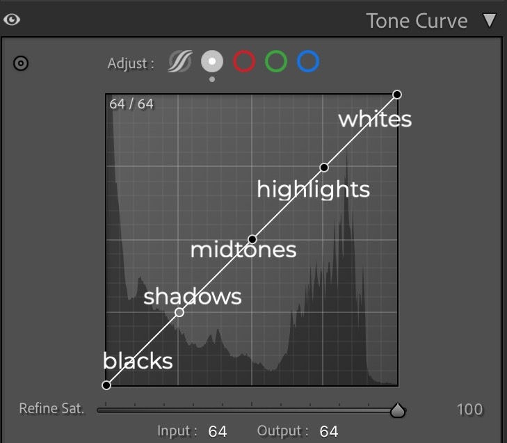
Why Use Tone Curves?
Boost Contrast:
A subtle S-curve can deepen shadows and brighten highlights, giving your image more depth and impact.
Recover Details:
Fine-tuning the curve in darker or brighter areas can reveal details that might otherwise be lost.
Creative Flexibility:
Tone curves empower you to experiment with the overall mood of your photo, whether you’re after a dramatic effect or a gentle enhancement.
Pro Tip:
Make small, gradual adjustments—the tone curve is highly responsive, so even slight changes can significantly impact your image.
For more detailed insights and step-by-step instructions, check out my guide, How to Use Tone Curve in Lightroom to Enhance Your Photos. This resource dives deeper into harnessing the full potential of tone curves, helping you transform your editing process with precision.
Mastering tone curves can truly elevate your photography by giving you complete control over the interplay of light and shadow.
Part V: Wrapping Up and Next Steps
Now that you've explored Lightroom’s core tools—from the Basic Panel and Color Mixer to Color Grading and Tone Curves—you’re well on your way to transforming your editing workflow.
Remember, every adjustment, no matter how small, can dramatically impact the final look of your photos. The key is to experiment, observe the changes, and refine your approach until you achieve that perfect balance.
Next Steps:
Practice: Apply what you’ve learned on a variety of images. Experiment with different settings and see how they work together to create the mood and style you’re aiming for.
Explore More: Dive deeper into other techniques with our additional guides:
Stay Connected + Educated
Stay in the Know!
Don’t miss out on my latest tips, updates, and exclusive content—sign up for my newsletter and get the good stuff delivered straight to your inbox! Join Here
Want to connect with fellow creatives, share your edits, and get more tips on using Lightroom?
Join our Jaide & Jett Presets Facebook Group!
For ongoing tips, updates, and creative inspiration, subscribe to our newsletter and join the Jaide & Jett Presets Facebook group. Connect with fellow photographers, share your edits, and keep learning together.
Share your thoughts and like this post...
If you found this guide helpful, please share it with other photographers looking to elevate their editing skills. Happy editing!
If you're ready to take your editing further, grab my Jaide & Jett Presets for a creative, easy way to enhance your photos and streamline your workflow.


Comentários