
How to Use Tone Curve in Lightroom to Enhance Your Photos
- Cienna So
- Jan 24
- 8 min read
Updated: Mar 6
Let me show you one of (if not the most) powerful tools in Lightroom that will completely elevate your editing: the Tone Curve.
Every photographer’s secret weapon.
The Tone Curve gives you total control over light, contrast, and depth in your photos. It lets you fix tricky lighting, fine-tune details, and shape your signature style with precision. Whether you're making subtle adjustments or creating bold, dramatic edits, this tool gives you the flexibility to bring your vision to life. Once you start using it, you’ll see just how versatile it really is.
Looks complicated? Not for long.
I know the Tone Curve can look a little intimidating at first—those lines and adjustments can be confusing, especially when you're not sure how they affect your photo. But don’t worry! I’m here to walk you through it, step by step, so you'll understand exactly how each part works. And with short video tutorials, you’ll be amazed at how quickly you can bring your vision to life!
Editing with intention starts here.
Once you start working with the Lightroom curves, you'll realize just how much control you have over your photos. It’s not just about brightening or darkening—it’s about shaping the exact mood and feel you want. And once you master that, your photos will pop in ways you never imagined.
What is the Tone Curve in Lightroom?
Imagine you’re in a recording studio, sitting behind the mixing board. The song is playing, but instead of turning up the volume for the whole track, you get to adjust the sound of each instrument individually to create the perfect mix.
That’s exactly what the Tone Curve does for your photo. It gives you precise control over brightness and contrast in specific areas—like shadows, midtones, and highlights—without affecting the entire image.
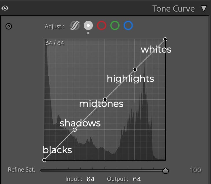
The 5 Key Points of the Tone Curve Explained
In this section, we’ll break down the five key points of the Tone Curve—whites, highlights, midtones, shadows, and blacks. By adjusting these areas, you have total control over the brightness and contrast in your photos, helping you shape your unique style.
We’ll explore how each adjustment helps you achieve different looks, like:
Crisp & Bright or Soft & Balanced
Light & Airy or Smooth & Creamy
Filmy and Vintage
Cinematic and Moody
These are just a few examples of what’s possible when you master the Tone Curve. So, whether you want to add more punch, create a dreamy, nostalgic effect, or give your photos a deep, cinematic vibe—this section will show you exactly how to do it.
Whites: Crisp & Bright or Soft & Balanced
Whites control the brightest parts of your photo, such as the glow of sunlight, bright clothing, or reflections on water. Adjusting this affects how strong or soft those bright areas appear.

Raising the whites makes the brightest areas even brighter, giving your image a clean, polished look. This is great for modern, high-contrast edits where you want whites to pop. However, be careful not to push it too far, as it can make highlights look harsh or blown out.
For a true film-inspired look, try lowering the whites point on the far right of the Tone Curve. Digital photos often have sharp, stark whites, while film naturally rolls off highlights more smoothly. Dropping this point slightly mimics the gentle highlight fade of film, making your edit feel softer and more organic.

Highlights: Light & Airy or Smooth & Creamy
Highlights control the lighter tones in your photo that aren’t pure white. These are often areas like sunlight on skin, the glow of clouds, or bright reflections. Adjusting highlights can give your photo either a fresh, light feel or a smooth, creamy effect.
Increasing highlights brightens the lighter parts of your image, giving it a clean, airy vibe. If you’re going for a bright, fresh edit, boosting highlights can make your photo feel light and crisp.
Lowering highlights brings back detail in bright areas, especially if they’ve been overexposed. This gives your photo a smooth, soft glow, perfect for creating a dreamy or film-like effect.
Midtones: The Heart of Your Image
Midtones are where most of the color and detail in your image live. They control the overall brightness without changing the extremes (shadows and highlights). Adjusting midtones affects the feel of your image as a whole.
Raising midtones brightens everything evenly, making the image feel fresh and natural.
Lowering midtones creates a deeper, more dramatic effect, which is great for adding mood and contrast to your image.

Shadows: Reveal Hidden Details or Add Bold Contrast
Shadows control the darker parts of your photo, like deep shadows in a forest or the shaded parts of your subjects face. Adjusting the shadows can help bring out hidden details or add drama to your image.
Raising shadows brings out hidden details in darker areas, which helps soften the overall image and balance the tones.
Lowering shadows deepens the contrast in dark areas, giving your photo a more dramatic, high-contrast feel.

Blacks: Deep & Dramatic or Soft & Faded
Blacks affect the deepest shadows in your photo. These are the areas where details disappear into pure black. Adjusting blacks changes how dark or soft the deepest parts of your photo appear.
Lowering blacks makes the darkest areas even darker, creating a crisp, high-contrast look.
Raising blacks softens the deep shadows, giving your photo a faded, more film-like feel that’s less harsh and more organic.

How Each Point Works Together
Now that you know what each part of the Tone Curve does, it’s time to talk about how they work together.
Think of the Tone Curve like a light dimmer with multiple controls. Instead of just brightening or darkening your entire room, imagine you have separate dimmers for different areas—one for the ceiling lights, another for the lamps, and one for the soft glow from a candle.
Adjusting one will change the overall mood, but it’s the combination of all the light sources that creates the perfect atmosphere.
That’s exactly how the Tone Curve works—it’s about adjusting whites, highlights, midtones, shadows, and blacks together to create the exact mood you want.
Want to see this in action? Watch my TikTok tutorial where I break down the Tone Curve step by step—so you can master it in minutes! → Watch Here
Locating the Tone Curve Panel
In Lightroom Desktop, head to the Develop module. On the right-hand panel, you’ll see the Tone Curve located just below the Basic panel.
Finding the Tone Curve in Lightroom Mobile
If you're using Lightroom Mobile, the process is a bit different, but don't worry—it's just as easy to access the Tone Curve and start editing on the go!
Open your image in the Lightroom Mobile app.
Tap the Edit icon (the sliders icon) at the bottom of the screen.
Select the Light Panel.
From there tap on Tone Curve, and you’ll see the familiar curve graph where you can start adjusting the shadows, highlights, and more!

How to Use the Tone Curve in Lightroom
Now that you understand what the Tone Curve is and what it can do for your photos, let’s get into the details of how to adjust it.
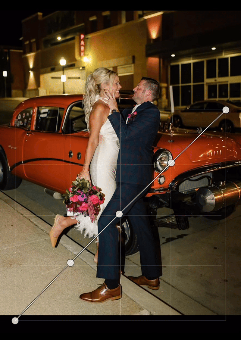
Creating an S-Curve for Contrast
One of the most common adjustments is the S-curve.
Here's how to do it:
Lower the shadows (bottom-left of the curve).
Lift the highlights (top-right of the curve).
This creates a natural contrast by deepening the shadows and brightening the lightest areas. It adds dimension and depth to your image, making it pop with more vibrancy.

Fine-Tuning with Points
You can create adjustable points directly on the Tone Curve by clicking on it. Each point lets you adjust specific tonal ranges in your image:
You can raise or lower the points to target specific areas of your photo for more control. This is where you can add extra precision to your edits.

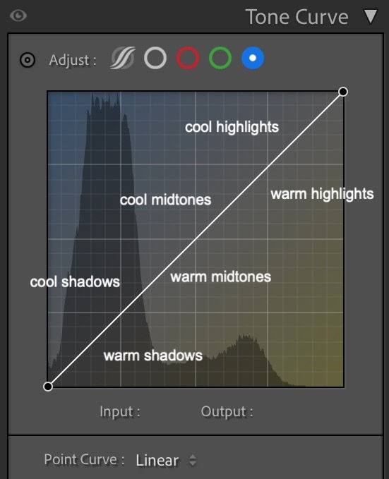
Using the RGB Channels for Color Grading in Lightroom
The Tone Curve is more than just about light and contrast—it’s also a fantastic tool for adding color grading to your images. With the RGB channels in the Tone Curve, you can adjust the Red, Green, and Blue channels individually to create a unique, artistic touch in your photos.
If you’ve ever seen a photo with that perfect vintage warmth or cool cinematic look, it’s likely that the photographer used color grading to create that effect. Here’s how you can do the same!

When you adjust the RGB channels in Lightroom, think of it like painting your photo with the colors you add to the shadows, midtones, or highlights. The slider you move corresponds to how much of that color gets added to that specific part of the image.

What is Color Grading with the RGB Channels?
In Lightroom, color grading refers to the process of adjusting the colors in your image to achieve a specific mood or aesthetic. While the Tone Curve mainly controls light and contrast, the RGB channels allow you to adjust individual color channels (Red, Green, and Blue) to add creative, stylized tones to your photos.


What’s Happening When You Adjust RGB?
Each of the RGB channels (Red, Green, and Blue) works like a color filter. Here's a breakdown of how each one works:
Red Channel:
When you raise the red slider, you’re adding red tones to the shadows, midtones, or highlights (depending on where you move the point).
Lowering the red slider removes the reds, giving the photo a cooler tone.
Green Channel:
Adjusting the green slider adds green tones to the image. Increasing it can bring out natural, earthy tones (like trees or grass), while decreasing it will make the photo feel less green or more neutral.

Blue Channel:
When you increase the blue slider, you add blue tones to the shadows or highlights of your photo, creating a cooler or chilly effect.
Lowering the blue slider removes those cool tones, giving your image a warmer, yellow look.
Why Use the Tone Curve in Lightroom?
The tone curve is one of Lightroom’s most powerful features because it allows for both subtle and dramatic changes in your photos. Whether you’re trying to enhance a moody vibe, add contrast, or create a vintage film look, the tone curve gives you the flexibility to achieve your vision. It’s especially useful for documentary-style photographers who rely on capturing raw emotion through light and shadow.
Quick Tip: Experiment with Presets!
If you want to save time and make your editing process easier, start with one of my presets from Jaide & Jett, like the Natural Preset Pack or Modular Preset Pack. These presets provide a solid base for your images, and from there, you can adjust the preset’s tone curve points to customize the shadows, highlights, and midtones. This way, you can fine-tune the look and bring your creative vision to life while saving time in post-processing. Shop Here
Stay in the Know!
Don’t miss out on my latest tips, updates, and exclusive content—sign up for my newsletter and get the good stuff delivered straight to your inbox! Join Here

Join My Facebook Group for More Tips
If you're eager to learn more about editing and share your progress, I’d love to invite you to my Photography Editing Community on Facebook. It’s a great place to ask questions, get feedback, and connect with other creative photographers!


Now Reading: How to Use Tone Curve in Lightroom to Enhance Your Photos
Share your thoughts and like this post...
If you found this post helpful, don’t forget to like and share it with fellow photographers and creators who could use a little editing magic! Let’s spread the love and help others make their photos pop too!


Comments